Flight deck / Development journal
A new seat on the flight deck
The cockpit gains material detail while keeping its instruments at the center of the experience.
First Principles Interactive
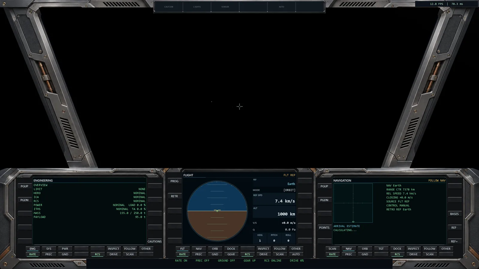
The flight deck is where most of a pilot’s time in Departure 2150 will be spent. It needs to be readable during an approach and comfortable to return to after a long crossing.
Earlier versions established the arrangement: engineering to one side, navigation to the other, and the attitude display in the center. That layout gave us a working place to fly while the surrounding cockpit was still visually simple.
Giving the panels a home
The new artwork adds graphite surfaces, metal frames, recessed controls, and restrained copper accents. The display surrounds now feel seated in a dashboard. The windshield keeps its open view, with the structure pushed toward the edges.
The screens themselves remain live. Their numbers, labels, attitude indication, and navigation cues come from the running simulation. The artwork gives that information a physical setting.
Built around use
The center instrument remains the visual anchor. Engineering and navigation can be checked with a glance to either side, and the displays can be expanded when a task needs more room.
This is an evolving flight deck. The aim is to make an instrument familiar enough that, after a few flights, you reach for it without thinking about the interface.